Circular Progress Bars in .NET MAUI
Learn how to create a reusable custom UI control with an embedded GraphicsView and child content in .NET MAUI 10
I think in Flutter controls are called widgets, in React we call them components but
essentially they are all some kind of custom, user-defined UI elements.
For a time
tracking app, I need a circular progress control that I have not found elsewhere. It should have two
rings and an area for child content. The inner ring shows the planned time. The outer ring shows any
additional time after the planned time has elapsed. The area in the middle hosts child controls. In
my case, it contains a VerticalStackLayout with labels that show both times.
I also want to reuse the control, so I do not want to hardcode its content or appearance. In this
post, we build it from first principles with GraphicsView, IDrawable, bindable properties, and a
control template. You should be familiar with basic C# and XAML, but you do not need experience with
custom drawing.

The design consists of two circles and two arcs. For the child controls, we need to calculate the area within the inner circle and clip the content if needed.
Now comes the hard part. I am new to .NET MAUI and I have no idea how to create a custom control with custom graphics.
To me this is the same as cooking vs. ordering a finished meal. I want to learn how to cook and understand the ingredients not optimize the time to get the dish onto the table as quickly as possible. Both cases are equally important, you need to know which path you are going to choose. Of course, AI agents such as Copilot, Claude, and Codex are capable of creating this control for me, probably within a few minutes. But my goal is not to have the control immediately. I want to learn how it works and understand the ideas behind it.
I started with the .NET MAUI documentation. Let’s look directly at the graphics documentation.
It first compares the two available approaches:
There are many similarities between the functionality provided by Microsoft.Maui.Graphics, and the functionality provided by .NET MAUI shapes and brushes. However, each is aimed at different scenarios:
The documentation describes Microsoft.Maui.Graphics as follows:
Microsoft.Maui.Graphics functionality must be consumed on a drawing canvas, enables performant graphics to be drawn, and provides a convenient approach for writing graphics-based controls. For example, a control that replicates the GitHub contribution profile can be more easily implemented using Microsoft.Maui.Graphics than by using .NET MAUI shapes.
It describes .NET MAUI shapes this way:
.NET MAUI shapes can be consumed directly on a page, and brushes can be consumed by all controls. This functionality is provided to help you produce an attractive UI.
I am not sure which one to use. Shapes sound easier, so let’s look at them first.
Shapes
A circle needs only a few XAML attributes:
<Ellipse Stroke="Red"
         StrokeThickness="4"
         WidthRequest="150"
         HeightRequest="150"
         HorizontalOptions="Start" />
Drawing the elements and arranging them within a grid looks manageable. An arc, however, needs more markup:
<Path Stroke="Black">
    <Path.Data>
        <PathGeometry>
            <PathGeometry.Figures>
                <PathFigureCollection>
                    <PathFigure StartPoint="10,10">
                        <PathFigure.Segments>
                            <PathSegmentCollection>
                                <ArcSegment Size="100,50"
                                            RotationAngle="45"
                                            IsLargeArc="True"
                                            SweepDirection="CounterClockwise"
                                            Point="200,100" />
                            </PathSegmentCollection>
                        </PathFigure.Segments>
                    </PathFigure>
                </PathFigureCollection>
            </PathGeometry.Figures>
        </PathGeometry>
    </Path.Data>
</Path>
That is quite a lot of indentation for one arc. It is possible to use shapes because the geometry is bindable. A code-behind file could perform the calculations and update the shapes. However, that would require considerable plumbing and could make the XAML difficult to read.
So let’s look at the graphics API.
GraphicsView
To draw something on the screen, the
documentation
tells us to create a class that implements IDrawable. Start by creating a .NET MAUI app in Visual
Studio or an IDE of your choice. Then add a class in the CircularProgressBar.Mobile.Controls
namespace:
namespace CircularProgressBar.Mobile.Controls;

public class CircularProgressBarDrawable : IDrawable
{
    public void Draw(ICanvas canvas, RectF dirtyRect)
    {
        // Drawing code goes here
    }
}
Then replace the contents of MainPage.xaml with:
<?xml version="1.0" encoding="utf-8" ?>
<ContentPage
  xmlns="http://schemas.microsoft.com/dotnet/2021/maui"
  xmlns:x="http://schemas.microsoft.com/winfx/2009/xaml"
  x:Class="CircularProgressBar.Mobile.MainPage"
  xmlns:control="clr-namespace:CircularProgressBar.Mobile.Controls"
>
  <GraphicsView
    x:Name="GraphicsView"
    HeightRequest="400"
    WidthRequest="400"
    HorizontalOptions="Center"
    VerticalOptions="Center"
  >
    <GraphicsView.Drawable>
      <control:CircularProgressBarDrawable />
    </GraphicsView.Drawable>
  </GraphicsView>
</ContentPage>
We explicitly set GraphicsView.Drawable to control:CircularProgressBarDrawable. This connects
the GraphicsView to our CircularProgressBarDrawable class.
Next, add some code to draw a few circles:
public void Draw(ICanvas canvas, RectF dirtyRect)
{
    canvas.SaveState();

    canvas.FillColor = Colors.LightSlateGrey;
    canvas.FillRectangle(dirtyRect);

    canvas.RestoreState();

    double radius = 5.0;
    for (int i = 0; i < 200; i++)
    {
        canvas.DrawCircle(new Point(10.0, 10.0), radius);
        radius += 5.0;
    }

}
The method starts by saving the current canvas state. Drawing state is stateful, so SaveState()
and RestoreState() work together like a scope. Properties changed between these calls are restored
afterwards. Here, that applies to FillColor, which we set to Colors.LightSlateGrey before
filling the area described by RectF dirtyRect.
Next, we draw circles centered at $(10,10)$. The first radius is $5$, and each loop iteration increases it by $5$.
Running the app reveals:
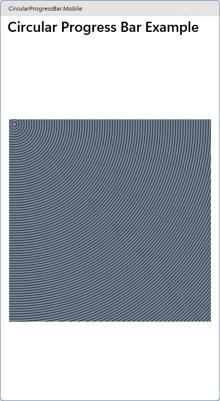
Nice, we have drawn circles! We now know how to draw on the canvas. The remaining work is to calculate the geometry for our custom control.
Now we face the next question: how do we turn this into a custom control? We need to make the radius, its increment, the number of circles, and their center configurable.
Custom Control
To create the custom control, add a .NET MAUI ContentView (XAML) to the project. I named it
CircularProgressBarView.xaml and placed it in the CircularProgressBar.Mobile.Controls namespace.
First, move the GraphicsView from MainPage.xaml into the new CircularProgressBarView.xaml. Do
not set <GraphicsView.Drawable> here. The control should configure its own internals instead of
exposing them as part of its API.
<?xml version="1.0" encoding="utf-8" ?>
<ContentView
  xmlns="http://schemas.microsoft.com/dotnet/2021/maui"
  xmlns:x="http://schemas.microsoft.com/winfx/2009/xaml"
  x:Class="CircularProgressBar.Mobile.Controls.CircularProgressBarView"
  xmlns:control="clr-namespace:CircularProgressBar.Mobile.Controls"
>
  <Grid>
    <GraphicsView
      x:Name="GraphicsView"
      HeightRequest="400"
      WidthRequest="400"
      HorizontalOptions="Center"
      VerticalOptions="Center"
    />
  </Grid>
</ContentView>
The connection now happens in the code-behind file, CircularProgressBarView.xaml.cs. There we
create a bindable property for the number of circles. According to the
documentation on how to create a custom control
we need a BindableProperty field and a corresponding C# property:
namespace CircularProgressBar.Mobile.Controls;

public partial class CircularProgressBarView : ContentView
{
    public static readonly BindableProperty NumberOfCirclesProperty = BindableProperty.Create(
        nameof(NumberOfCircles),
        typeof(int),
        typeof(CircularProgressBarView),
        100
    );

    public int NumberOfCircles
    {
        get => (int)GetValue(NumberOfCirclesProperty);
        set => SetValue(NumberOfCirclesProperty, value);
    }

    public CircularProgressBarView()
    {
        InitializeComponent();
    }
}
So far, the control is straightforward. Because we did not set GraphicsView.Drawable, we now need
to create the drawable ourselves and pass it the NumberOfCircles value.
First we adapt CircularProgressBarDrawable and give it some properties with default values:
public class CircularProgressBarDrawable : IDrawable
{
    public int NumberOfCircles { get; set; } = 100;
    public double InitialRadius { get; set; } = 5.0;
    public double RadiusIncrement { get; set; } = 5.0;

    public Point Center { get; set; } = new Point(10.0, 10.0);

    public void Draw(ICanvas canvas, RectF dirtyRect)
    {
        canvas.SaveState();

        canvas.FillColor = Colors.LightSlateGrey;
        canvas.FillRectangle(dirtyRect);

        canvas.RestoreState();

        double radius = InitialRadius;
        for (int i = 0; i < NumberOfCircles; i++)
        {
            canvas.DrawCircle(Center, radius);
            radius += RadiusIncrement;
        }
    }
}
Then, in CircularProgressBarView.xaml.cs, add a field and update the constructor:
public partial class CircularProgressBarView : ContentView
{
    ...

    private readonly CircularProgressBarDrawable _circularProgressBarDrawable = new();

    public CircularProgressBarView()
    {
        InitializeComponent();
        GraphicsView.Drawable = _circularProgressBarDrawable;
    }
}
To make our custom control interactive, let’s add a slider to the main page and use it to change the number of circles. We can demonstrate the binding without introducing a view model.
A slider returns a floating-point value, but our control accepts an integer. The
CommunityToolkit.Maui package provides a DoubleToIntConverter that we can use in XAML:
dotnet add package CommunityToolkit.Maui
Register the toolkit by adding builder.UseMauiCommunityToolkit() to MauiProgram.cs.
Then add the slider and bind its value to our custom control in MainPage.xaml:
<?xml version="1.0" encoding="utf-8" ?>
<ContentPage
  xmlns="http://schemas.microsoft.com/dotnet/2021/maui"
  xmlns:x="http://schemas.microsoft.com/winfx/2009/xaml"
  x:Class="CircularProgressBar.Mobile.MainPage"
  xmlns:control="clr-namespace:CircularProgressBar.Mobile.Controls"
  xmlns:toolkit="http://schemas.microsoft.com/dotnet/2022/maui/toolkit"
>
  <ContentPage.Resources>
    <toolkit:DoubleToIntConverter x:Key="DoubleToIntConverter" />
  </ContentPage.Resources>

  <VerticalStackLayout>
    <control:CircularProgressBarView
      x:Name="CircularProgressBar"
      NumberOfCircles="{Binding Value, Source={x:Reference CircleSlider}, Converter={StaticResource DoubleToIntConverter}}"
    />

    <Grid ColumnDefinitions="150,*" ColumnSpacing="15" Margin="20">
      <Label
        Text="{Binding Value, Source={x:Reference CircleSlider}, StringFormat='Number of Circles: {0:F0}'}"
        HorizontalOptions="Center"
        VerticalOptions="Center"
        Grid.Column="0"
      />
      <Slider
        x:Name="CircleSlider"
        Minimum="0"
        Maximum="110"
        Value="20"
        Grid.Column="1"
        VerticalOptions="Center"
      />
    </Grid>
  </VerticalStackLayout>
</ContentPage>
Everything builds and runs so far, but the result is not quite right.
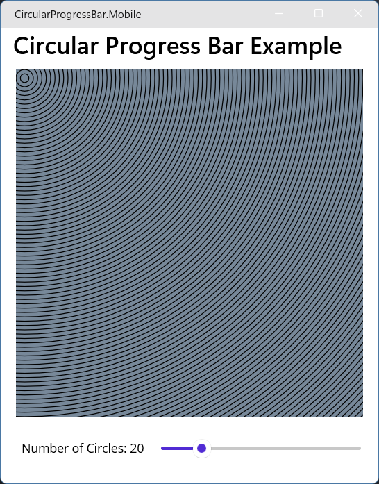
Moving the slider does not change the number of circles. At startup, the slider is set to $20$, but many more circles appear. What is happening?
When the slider is moved, the binding updates CircularProgressBarView.NumberOfCircles, but the
drawable still contains its default value of $100$. In addition, changing the drawable does not
automatically redraw the GraphicsView.
There are probably several ways to solve this. I find the following approach straightforward.
BindableProperty.Create accepts a callback that runs when the value changes:
public static readonly BindableProperty NumberOfCirclesProperty = BindableProperty.Create(
    nameof(NumberOfCircles),
    typeof(int),
    typeof(CircularProgressBarView),
    100,
    propertyChanged: OnPropertyOfDrawableChanged
);
OnPropertyOfDrawableChanged receives the custom view and tells it to update the graphics view.
private static void OnPropertyOfDrawableChanged(
    BindableObject bindable,
    object oldValue,
    object newValue
)
{
    // Pattern matching verifies the runtime type and avoids an invalid cast.
    if (bindable is CircularProgressBarView view)
    {
        view.UpdateDrawable();
    }
}
UpdateDrawable sets the drawable’s NumberOfCircles property and tells the graphics view to
redraw:
private void UpdateDrawable()
{
    _circularProgressBarDrawable.NumberOfCircles = NumberOfCircles;
    GraphicsView?.Invalidate();
}
Now the control behaves as expected. We can use the same pattern for other drawable properties.
Child Controls
I found two ways to support child controls. I am not sure which one is idiomatic because the documentation does not provide a concrete example for this use case, so I will present both.
The MAUI Community Toolkit also has a source generator BindableProperty. This reduces
duplication of defining these bindable properties. Definitly worth looking into.
One
way is to use the ContentProperty attribute. The
ContentProperty documentation
only covers this briefly. This option is mainly based on a
Stack Overflow answer.
The MAUI Community Toolkit uses this approach in several
controls.
IMHO the documentation for templates is written for people that already understand
templates. At first I could not really get the core idea. I have written a small introduction to
templates make the concept easier to understand for myself. If you already know templates, you can
skip it.
The other option uses control templates, which have more extensive
documentation.
The idea is to split the visual structure of the control and the content of the control. The visual
structure is defined in the template with a placeholder for child content. In contrast to the
ContentProperty approach, this option is more explicit and needs more wiring.
I completed the control with a control template because that option is better documented.
Option A: Using ContentProperty
Let’s start by adding a child to our control in MainPage.xaml:
<control:CircularProgressBarView
  x:Name="CircularProgressBar"
  NumberOfCircles="{Binding Value, Source={x:Reference CircleSlider}, Converter={StaticResource DoubleToIntConverter}}"
>
  <Label
    Text="Hello World!"
    HorizontalTextAlignment="Center"
    VerticalTextAlignment="Center"
    FontSize="24"
  />
</control:CircularProgressBarView>
When we run the application, the label completely replaces the graphics view.
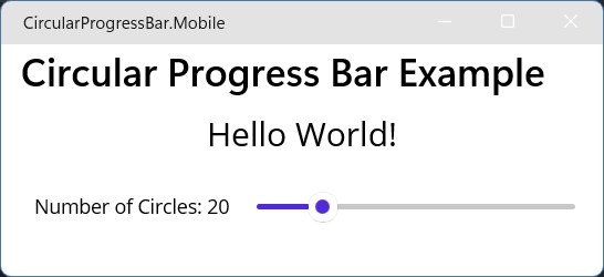
The documentation for ContentProperty explains this behavior. The label is assigned to the custom
control’s inherited Content property, replacing the graphics view. To prevent that, we use
ContentProperty to redirect the child content to another property. Update
CircularProgressBarView.xaml.cs as follows:
[ContentProperty(nameof(CenterContent))]
public partial class CircularProgressBarView : ContentView
{
    public static readonly BindableProperty CenterContentProperty = BindableProperty.Create(
        nameof(CenterContent),
        typeof(View),
        typeof(CircularProgressBarView)
    );

    public View? CenterContent
    {
        get => (View?)GetValue(CenterContentProperty);
        set => SetValue(CenterContentProperty, value);
    }

    // rest of class unchanged
}
When we run the application now, the custom control displays nothing. We redirected the child into
CenterContent, so the inherited Content property is no longer set implicitly. We must update
CircularProgressBarView.xaml and explicitly wrap the control’s visual structure in
<ContentView.Content>.
<ContentView.Content>
  <Grid>
    <GraphicsView
      x:Name="GraphicsView"
      HeightRequest="400"
      WidthRequest="400"
      HorizontalOptions="Center"
      VerticalOptions="Center"
    />
  </Grid>
</ContentView.Content>
Now the graphics view is back when the application is run.
To display the child content, add a ContentView and bind it to CenterContent. Set x:Name to
this so the binding can reference the custom control instance. We also set ZIndex explicitly to
control which element appears on top.
<?xml version="1.0" encoding="utf-8" ?>
<ContentView
  xmlns="http://schemas.microsoft.com/dotnet/2021/maui"
  xmlns:x="http://schemas.microsoft.com/winfx/2009/xaml"
  x:Class="CircularProgressBar.Mobile.Controls.CircularProgressBarView"
  xmlns:control="clr-namespace:CircularProgressBar.Mobile.Controls"
  x:Name="this"
>
  <ContentView.Content>
    <Grid>
      <GraphicsView
        x:Name="GraphicsView"
        HeightRequest="400"
        WidthRequest="400"
        HorizontalOptions="Center"
        VerticalOptions="Center"
        ZIndex="0"
      />

      <ContentView
        Content="{Binding CenterContent, Source={x:Reference this}}"
        HorizontalOptions="Fill"
        VerticalOptions="Fill"
        ZIndex="1"
      />
    </Grid>
  </ContentView.Content>
</ContentView>
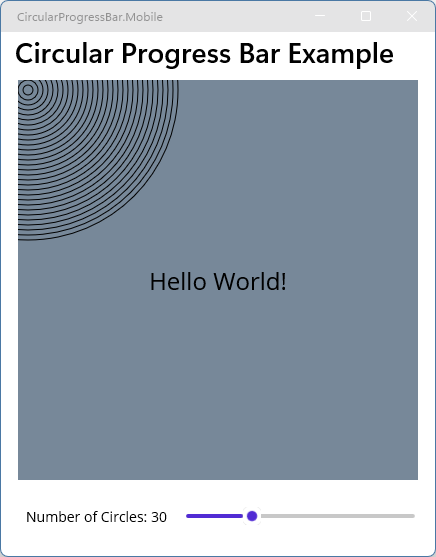
The child content now appears above the graphics view.
Option B: Using control templates
Before we give our custom control a template, we need to understand how control templates work in .NET MAUI. If you already know them, you can skip the next section.
How do templates work?
For me, the easiest mental model of how templates work is:
A
ControlTemplateis a replaceable XAML body for aContentVieworContentPage. It defines the visual structure separately from the logic of the control or page.
The control owns the data and behavior, while the template determines what the control looks like.
The
documentation
directly jumps into RelativeSource, TemplatedParent, Resources, etc. without describing this
core idea.
Let’s set custom controls aside for a moment and start with a normal page:
<ContentPage
    xmlns="http://schemas.microsoft.com/dotnet/2021/maui"
    xmlns:x="http://schemas.microsoft.com/winfx/2009/xaml"
    x:Class="MyApp.MainPage">

</ContentPage>
Next, give this page a control template:
<ContentPage
    xmlns="http://schemas.microsoft.com/dotnet/2021/maui"
    xmlns:x="http://schemas.microsoft.com/winfx/2009/xaml"
    x:Class="MyApp.MainPage">

    <ContentPage.ControlTemplate>
        <ControlTemplate>
            <Border
                BackgroundColor="LightBlue"
                Padding="30">

                <Label
                    Text="I came from the template"
                    FontSize="24" />

            </Border>
        </ControlTemplate>
    </ContentPage.ControlTemplate>

</ContentPage>
The page’s visual structure now comes from the template. We can think of the following XAML:
<ContentPage>
    ...
</ContentPage>
as an object with a property assignment like this:
page.ControlTemplate = someTemplate;
When MAUI applies the template, it creates the controls described by the template and puts them in the page’s visual tree.
ContentPage
    └── ControlTemplate
            └── Border
                    └── Label
This is the core concept.
In most cases, it makes sense to put the template in a resource dictionary, either on the page or in a separate resource file. This makes the template reusable and keeps it separate from the page content.
This leads to:
<ContentPage
    xmlns="http://schemas.microsoft.com/dotnet/2021/maui"
    xmlns:x="http://schemas.microsoft.com/winfx/2009/xaml"
    x:Class="MyApp.MainPage"
    ControlTemplate="{StaticResource BlueTemplate}">

    <ContentPage.Resources>
        <ControlTemplate x:Key="BlueTemplate">
            <Border
                BackgroundColor="LightBlue"
                Padding="30">

                <Label
                    Text="Hello from the template"
                    FontSize="24" />

            </Border>
        </ControlTemplate>
    </ContentPage.Resources>
</ContentPage>
The setter ControlTemplate="{StaticResource BlueTemplate}" references the template by its
BlueTemplate key. The mental model is now:
ResourceDictionary
    └── "BlueTemplate"
          └── Border
                └── Label


ContentPage
    └── ControlTemplate = BlueTemplate
No magic so far.
Now we can add child content. Suppose we have a page with both content and a template:
<ContentPage
    ...
    ControlTemplate="{StaticResource BlueTemplate}">

    <VerticalStackLayout>
        <Label Text="Username" />
        <Entry />
        <Button Text="Login" />
    </VerticalStackLayout>

</ContentPage>
We now have a problem. Where should the content appear? We need a mechanism to say:
Put the content of the page here.
This is what ContentPresenter does. It is the location within the template where the content of
the page is inserted.
Update the template to include it:
<ControlTemplate x:Key="BlueTemplate">
    <Border
        BackgroundColor="LightBlue"
        Padding="30">

        <ContentPresenter />

    </Border>
</ControlTemplate>
Conceptually, the model becomes:
ResourceDictionary
    └── "BlueTemplate"
          └── Border
                └── ContentPresenter


ContentPage
    ├── ControlTemplate = BlueTemplate
    └── Content
          └── VerticalStackLayout
                ├── Label
                ├── Entry
                └── Button
When the page is instantiated, the ContentPresenter displays the page’s content. The resulting
control tree is:
Border
└── VerticalStackLayout
    ├── Label
    ├── Entry
    └── Button
No real magic behind. I wish the offical documentation would sometimes be more tutorial than reference, especially in the fundamentals section. Sometimes simple examples are much more useful than fancy examples using multiple things at once. This is the key concept because the same model also applies to a custom control.
Migrating the custom control to control templates
To convert our custom control to a control template, start by updating
CircularProgressBarView.xaml:
<?xml version="1.0" encoding="utf-8" ?>
<ContentView
  xmlns="http://schemas.microsoft.com/dotnet/2021/maui"
  xmlns:x="http://schemas.microsoft.com/winfx/2009/xaml"
  x:Class="CircularProgressBar.Mobile.Controls.CircularProgressBarView"
>
  <ContentView.Resources>
    <ControlTemplate x:Key="CircularProgressBarTemplate">
      <Grid>
        <GraphicsView
          x:Name="GraphicsView"
          HeightRequest="400"
          WidthRequest="400"
          HorizontalOptions="Center"
          VerticalOptions="Center"
          ZIndex="0"
        />

        <ContentPresenter />
      </Grid>
    </ControlTemplate>
  </ContentView.Resources>
</ContentView>
Then update the code-behind file, CircularProgressBarView.xaml.cs:
namespace CircularProgressBar.Mobile.Controls;

public partial class CircularProgressBarView : ContentView
{
    public static readonly BindableProperty NumberOfCirclesProperty = BindableProperty.Create(...);
    public int NumberOfCircles { ... }
    private readonly CircularProgressBarDrawable _circularProgressBarDrawable = new();

    public CircularProgressBarView()
    {
        InitializeComponent();
    }

    protected override void OnApplyTemplate()
    {
        base.OnApplyTemplate();

        var graphicsView = GetTemplateChild("GraphicsView") as GraphicsView;
        graphicsView?.Drawable = _circularProgressBarDrawable;
        UpdateDrawable();
    }

    private void UpdateDrawable()
    {
        _circularProgressBarDrawable.NumberOfCircles = NumberOfCircles;

        var graphicsView = GetTemplateChild("GraphicsView") as GraphicsView;
        graphicsView?.Invalidate();
    }

    private static void OnPropertyOfDrawableChanged(
        BindableObject bindable,
        object oldValue,
        object newValue
    ) {...}

}
The main difference is that we now need OnApplyTemplate to connect the drawable to the graphics
view. We cannot access the graphics view directly because it is part of the template. Instead, we
retrieve it with GetTemplateChild("GraphicsView"). The same applies to UpdateDrawable.
To make this work, set the template on our custom view in MainPage.xaml:
<control:CircularProgressBarView
  x:Name="CircularProgressBar"
  NumberOfCircles="{Binding Value, Source={x:Reference CircleSlider}, Converter={StaticResource DoubleToIntConverter}}"

  ControlTemplate="{StaticResource CircularProgressBarTemplate}"

>
  <Label
    Text="Hello World!"
    HorizontalTextAlignment="Center"
    VerticalTextAlignment="Center"
    FontSize="24"
  />
</control:CircularProgressBarView>
The templated control now works.
However, the API of our custom control is not ideal. Its consumers should not have to select the
control template because that template is an implementation detail. Let’s revert the change in
MainPage.xaml and set the ControlTemplate automatically.
The most direct approach I found is to set ControlTemplate explicitly in
CircularProgressBarView.xaml.cs. We do this in the constructor:
public CircularProgressBarView()
{
    InitializeComponent();
    var theControlTemplate = Resources["CircularProgressBarTemplate"];
    ControlTemplate = theControlTemplate as ControlTemplate;
}
Running the application again confirms that the control works without exposing its template in the public API.
Finalizing the control
We now know how to draw circles, expose bindable properties, and host child controls. Let’s connect these parts and complete the two progress rings.
We start with the drawable. A record groups the ring settings that do not change during a draw:
public readonly record struct RingProperties(
    float RingThickness,
    float RingSpacing,
    float StartAngle,
    float DisabledOpacity,
    Color TrackColor,
    Color ProgressColor
);
The constructor stores these settings for later draw calls. Values that can change while the control is running remain properties of the drawable:
private readonly RingProperties _ringProperties;

public CircularProgressBarDrawable(RingProperties ringProperties)
{
    _ringProperties = ringProperties;
}

public float InnerProgress { get; set; }
public float OuterProgress { get; set; }
public bool IsEnabled { get; set; } = true;
We also need two helper methods. NormalizeAngle keeps a finite angle within one rotation and uses
$90$ degrees when the input is not finite. ClampProgress limits finite progress values to the
range from $0$ to $1$:
private static float NormalizeAngle(float angle) => (float.IsFinite(angle)) ? angle % 360 : 90;
private static float ClampProgress(float progress) =>
    (float.IsFinite(progress)) ? Math.Clamp(progress, 0.0f, 1.0f) : 0.0f;
The Draw method starts by finding the largest diameter that fits inside dirtyRect:
public void Draw(ICanvas canvas, RectF dirtyRect)
{
    var diameter = Math.Min(dirtyRect.Width, dirtyRect.Height);

    var ringGeometry = RingsGeometry.Create(
        diameter,
        _ringProperties.RingThickness,
        _ringProperties.RingSpacing
    );

    ...
We pass that diameter to RingsGeometry.Create, which calculates the measurements for both rings:
private readonly record struct RingsGeometry(
    float Thickness,
    float OuterRadius,
    float InnerRadius,
    float ContentDiameter
)
{
    public static RingsGeometry Create(float diameter, float requestedThickness, float requestedSpacing)
    {
        float availableRadius = diameter / 2;
        float thickness = Math.Min(SanitizeLength(requestedThickness), availableRadius / 2);
        float remainingRadius = Math.Max(0, availableRadius - (2 * thickness));
        float spacing = Math.Min(SanitizeLength(requestedSpacing), remainingRadius);
        float outerRadius = Math.Max(0, availableRadius - (thickness / 2));
        float innerRadius = Math.Max(0, outerRadius - thickness - spacing);
        float contentDiameter = Math.Max(
            0,
            (float)((diameter - (4 * thickness) - (2 * spacing)) / Math.Sqrt(2.0))
        );
        return new RingsGeometry(thickness, outerRadius, innerRadius, contentDiameter);
    }
    private static float SanitizeLength(float value)
    {
        return (float.IsFinite(value) && value > 0) ? value : 0;
    }
}
Based on the available space, we determine whether the requested thickness fits. We then calculate
the outer radius, the inner radius, and the space for the child content. contentDiameter is the
side length of the largest square that fits inside the inner circle.
The drawable must notify the owning CircularProgressBarView when the available content size
changes. We do this with an event:
class CircularProgressBarDrawable : IDrawable
{
    public event Action<float>? ContentDiameterChanged;

    public float ContentDiameter { get; private set; } = 0.0f;

    private void SetContentDiameter(float contentDiameter)
    {
        if (ContentDiameter.Equals(contentDiameter))
        {
            return;
        }

        ContentDiameter = contentDiameter;
        ContentDiameterChanged?.Invoke(contentDiameter);
    }

    ...
}
The Draw method raises the event through SetContentDiameter whenever the calculated size
changes:
public void Draw(ICanvas canvas, RectF dirtyRect)
{
    var diameter = Math.Min(dirtyRect.Width, dirtyRect.Height);

    var ringGeometry = RingsGeometry.Create(
        diameter,
        _ringProperties.RingThickness,
        _ringProperties.RingSpacing
    );

    if (ringGeometry.Thickness <= 0 || ringGeometry.ContentDiameter <= 0)
    {
        SetContentDiameter(0.0f);
        return;
    }

    SetContentDiameter(ringGeometry.ContentDiameter);

    ...
With these measurements available, we can finish Draw. It finds the center of the canvas and draws
both rings and their progress arcs:
public void Draw(ICanvas canvas, RectF dirtyRect)
{
    var diameter = Math.Min(dirtyRect.Width, dirtyRect.Height);

    var ringGeometry = RingsGeometry.Create(
        diameter,
        _ringProperties.RingThickness,
        _ringProperties.RingSpacing
    );

    if (ringGeometry.Thickness <= 0 || ringGeometry.ContentDiameter <= 0)
    {
        SetContentDiameter(0.0f);
        return;
    }

    SetContentDiameter(ringGeometry.ContentDiameter);

    var center = new PointF(
        dirtyRect.Left + (dirtyRect.Width / 2),
        dirtyRect.Top + (dirtyRect.Height / 2)
    );
    float startAngle = NormalizeAngle(_ringProperties.StartAngle);

    canvas.SaveState();

    canvas.Alpha = IsEnabled ? 1.0f : _ringProperties.DisabledOpacity;
    canvas.StrokeSize = ringGeometry.Thickness;

    DrawRing(canvas, center, ringGeometry.InnerRadius, _ringProperties.TrackColor);
    DrawProgressArc(
        canvas,
        center,
        ringGeometry.InnerRadius,
        _ringProperties.ProgressColor,
        InnerProgress,
        startAngle
    );

    DrawRing(canvas, center, ringGeometry.OuterRadius, _ringProperties.TrackColor);
    DrawProgressArc(
        canvas,
        center,
        ringGeometry.OuterRadius,
        _ringProperties.ProgressColor,
        OuterProgress,
        startAngle
    );

    canvas.RestoreState();
}
The IsEnabled property determines the canvas opacity. We then draw each track ring followed by its
progress arc.
DrawRing sets the track style and draws a circle:
private static void DrawRing(ICanvas canvas, PointF center, float radius, Color trackColor)
{
    canvas.SaveState();
    canvas.StrokeLineCap = LineCap.Butt;
    canvas.StrokeColor = trackColor;
    canvas.DrawCircle(center, radius);
    canvas.RestoreState();
}
DrawProgressArc also handles empty and complete progress as special cases:
private static void DrawProgressArc(
    ICanvas canvas,
    PointF center,
    float radius,
    Color progressColor,
    float progress,
    float startAngle
)
{
    canvas.SaveState();

    canvas.StrokeLineCap = LineCap.Round;
    canvas.StrokeColor = progressColor;

    var clampedProgress = ClampProgress(progress);

    switch (clampedProgress)
    {
        case <= 0:
            break;
        case >= 1.0f:
            canvas.DrawCircle(center, radius);
            break;
        default:
        {
            float endAngle = startAngle - (clampedProgress * 360.0f);
            float left = (center.X - radius);
            float top = (center.Y - radius);
            float diameter = (radius * 2.0f);
            canvas.DrawArc(left, top, diameter, diameter, startAngle, endAngle, true, false);
            break;
        }
    }

    canvas.RestoreState();
}
When progress is $0$, there is nothing to draw. When it is $1$ or greater, we draw a complete circle
over the track. For values in between, we draw an arc from the start angle to the calculated end
angle. In DrawArc, the first boolean value, true, selects a clockwise arc. The second value,
false, leaves the arc open.
In CircularProgressBarView.xaml.cs, we declare the bindable properties and their C# wrappers. We
also keep references to the controls that we retrieve from the template:
namespace CircularProgressBar.Mobile.Controls;

public partial class CircularProgressBarView : ContentView
{
    // ... bindable properties and their C# wrappers ...

    private CircularProgressBarDrawable? _drawable;
    private GraphicsView? _graphicsView;

    public CircularProgressBarView()
    {
        PropertyChanged += OnViewPropertyChanged;

        InitializeComponent();
        ControlTemplate = Resources["CircularProgressBarTemplate"] as ControlTemplate;
    }

    protected override void OnApplyTemplate()
    {
        base.OnApplyTemplate();

        _graphicsView = GetTemplateChild("GraphicsView") as GraphicsView;
        ReplaceDrawable();
    }

    ...
}
As before, the constructor selects the template. OnApplyTemplate retrieves the named elements from
that template and initializes the drawable. ReplaceDrawable passes the current ring settings to a
new drawable and subscribes to its ContentDiameterChanged event:
private void ReplaceDrawable()
{
    if (_graphicsView is null)
    {
        return;
    }

    if (_drawable is not null)
    {
        _drawable.ContentDiameterChanged -= OnContentDiameterChanged;
    }

    _drawable = new CircularProgressBarDrawable(
        new RingProperties(
            RingThickness,
            RingSpacing,
            StartAngle,
            DisabledOpacity,
            TrackColor,
            ProgressColor
        )
    );

    _drawable.ContentDiameterChanged += OnContentDiameterChanged;
    _graphicsView.Drawable = _drawable;
    UpdateDrawable();
}
The drawable raises ContentDiameterChanged from its drawing code. The callback dispatches the UI
update and applies the calculated size to the child-content container:
private void OnContentDiameterChanged(float contentDiameter)
{
    Dispatcher.Dispatch(() =>
    {
        if (_centerContentContainer is null)
        {
            return;
        }

        _centerContentContainer.HeightRequest = contentDiameter;
        _centerContentContainer.WidthRequest = contentDiameter;
    });
}
UpdateDrawable remains almost unchanged:
private void UpdateDrawable()
{
    if (_drawable is null)
    {
        return;
    }
    _drawable.InnerProgress = InnerProgress;
    _drawable.OuterProgress = OuterProgress;
    _drawable.IsEnabled = IsEnabled;
    _graphicsView?.Invalidate();
}
The constructor also registers a callback for changes to the inherited IsEnabled property:
PropertyChanged += OnViewPropertyChanged;
The callback updates the drawable when IsEnabled changes:
private void OnViewPropertyChanged(object? sender, System.ComponentModel.PropertyChangedEventArgs e)
{
    if (e.PropertyName == nameof(IsEnabled))
    {
        UpdateDrawable();
    }
}
Finally, update the template in CircularProgressBarView.xaml. The consumer of the control now
determines its overall size, so the graphics view fills the available area. The named grid receives
the size calculated by the drawable and clips child content that extends beyond that area:
<?xml version="1.0" encoding="utf-8" ?>
<ContentView
  xmlns="http://schemas.microsoft.com/dotnet/2021/maui"
  xmlns:x="http://schemas.microsoft.com/winfx/2009/xaml"
  x:Class="CircularProgressBar.Mobile.Controls.CircularProgressBarView"
>
  <ContentView.Resources>
    <ControlTemplate x:Key="CircularProgressBarTemplate">
      <Grid>
        <GraphicsView
          x:Name="GraphicsView"
          HorizontalOptions="Fill"
          VerticalOptions="Fill"
          ZIndex="0"
        />

        <Grid
          x:Name="CenterContentContainer"
          HorizontalOptions="Center"
          VerticalOptions="Center"
          IsClippedToBounds="True"
          ZIndex="1"
        >
          <ContentPresenter />
        </Grid>
      </Grid>
    </ControlTemplate>
  </ContentView.Resources>
</ContentView>
With some other controls to set the properties, it’s working and looks like:
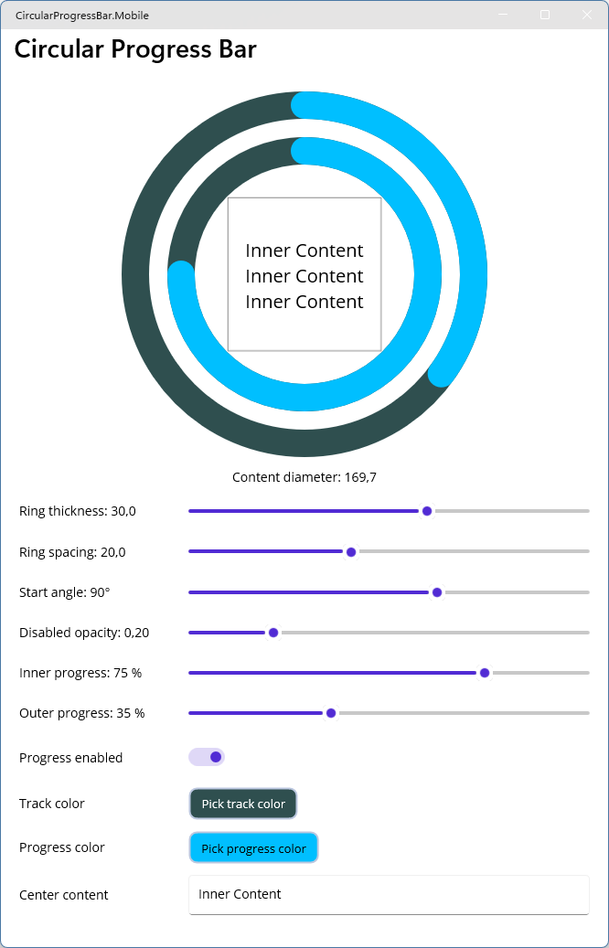
The published GitHub project refines this
tutorial code for use as a library. It renames the control to CircularProgressBar, moves it to the
CircularProgressBar.Maui namespace, narrows implementation types with internal and sealed, and
uses read-only bindable properties with TemplateBinding for the calculated content size. Those
changes improve the package API, but the underlying drawing and templating approach remains the
same. You can also install the finished control from
NuGet.